Fire Emblem Warriors: Three Hopes, slated for a June, 2022 release will feature the students that fans have grown attached to in Fire Emblem: Three Houses. The initial trailers explain the game’s premise: Byleth will be an obstacle while the player controls a new character named Shez.
The trailers for Three Hopes do not explain if the story will be a definitive timeline. However, the students appear to be younger than they are in the second half of FE:3H. Three trailers were dedicated to revealing the new character designs of the students. Fans have had mixed responses to these changes, but these changes help to make the game feel unique yet familiar.
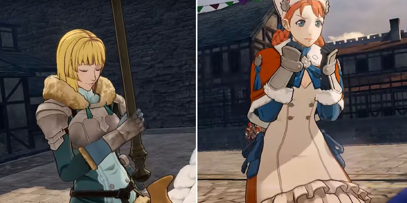
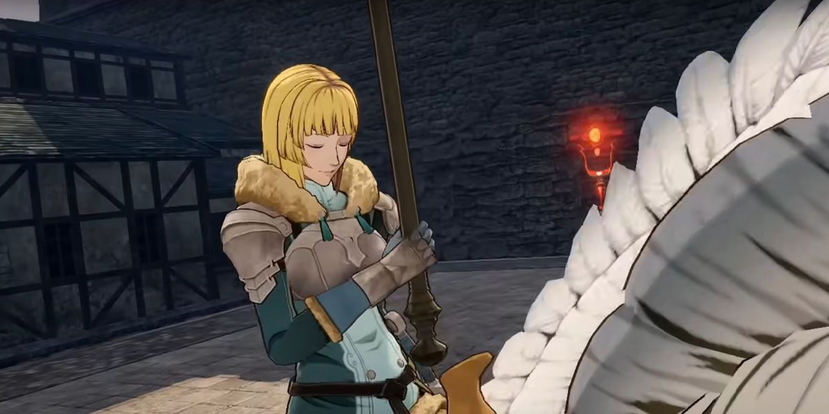
8 Ingrid’s Hair Looks Stiff And Unnatural
Out of all the Blue Lions, Ingrid’s change in appearance has received the most backlash. Her hair was quick to grab some negative attention since it seems to have been cut into chunks. The shorter pieces curl a little, while the bottom half of her hair is as stiff as a board. It would be in character for Ingrid to go for an efficient haircut rather than to doll herself up. After all, her main priority is to become the best knight she can be. She even shies away from things like makeup when other girls mention it. Her current haircut is still very likely to get into her face in battle, and her bangs would require a lot of maintenance.
Her post-game haircut in Fire Emblem: Three Houses does a much better job of giving Ingrid an efficient haircut, as her hair is swept out of her eyes and her hair is even shorter. Ingrid’s armor is also better after the time-skip, as it covers more of her body. The new one leaves her torso completely armor-less and vulnerable.
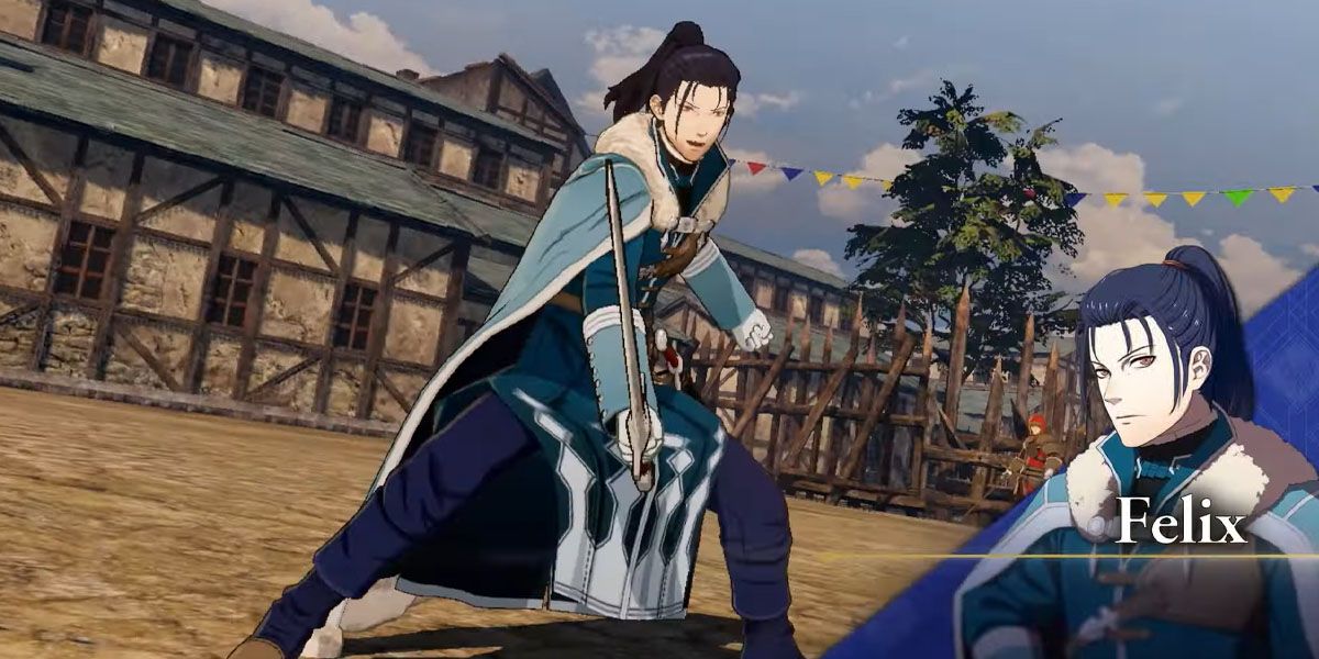
7 Felix’s Hair Gives Him An Odd Head Shape
Felix is another character whose post-timeskip design is superior to his new look. In Fire Emblem Warriors: Three Hopes, Felix has a high ponytail, but the puffy look on the side of his head in addition to the tilted hairline makes it seem as though his hair was incorrectly pasted onto his head. The long, high ponytail doesn’t suit him, but the ponytail is pulled off much better in his post-timeskip design.
His outfit is very similar in both designs, but the FEW3H design has his coat extend past his hips, with two pieces of fabric trailing down in front of and behind him. This looks like it could hinder his mobility or get in the way during battle, an issue that the post-timeskip design doesn’t have. It fixes the mobility problem, as the fabric doesn’t cover his left hip at all.
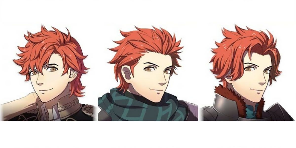
6 Sylvain’s Holst Haircut And Scarf Combo Look Out Of Place
Caspar and Sylvain have what fans call the “Holst haircut”, hair that is slicked back and spiked. It’s not a particularly popular haircut among fans. This type of haircut is usually used for characters who are motivated, loud, and bold. Sylvain is the opposite of a go-getter, as he strives to lower people’s expectations of him.
Although this carefree look may be somewhat suited for Sylvain, he had previously come across as someone who was more meticulous about his appearance. Both of his designs in Fire Emblem: Three Houses make it look as though Sylvain thoroughly groomed his hair to achieve a particular look. His scarf hides his neck and the large shoulder guards make him look much more bulky than usual. It feels that his hair and outfit clash, which is why many fans find his updated look unnatural.
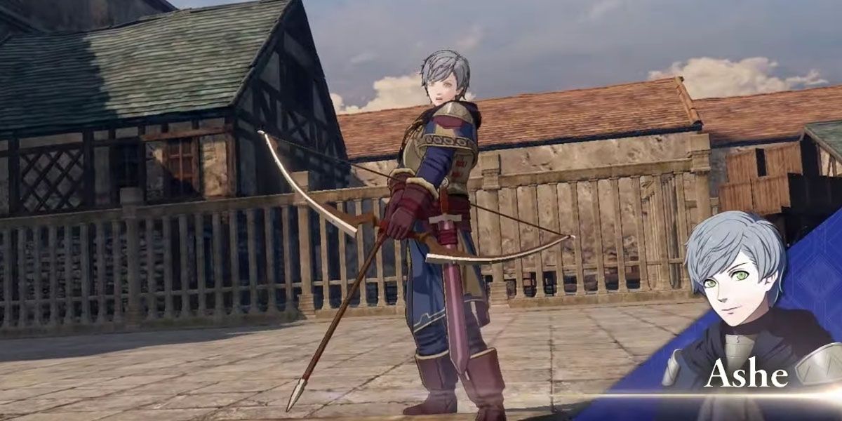
5 Ashe’s Change Is A Little Too Subtle
Ashe’s change is so subtle that his different designs need to be compared side by side in order for many people to notice the difference. His eyebrows were changed so that they don’t arch, which is a change so minuscule that it’s hard to say that it was necessary. His hair remains short and is swept out of his face. He has the same face shape as the post-timeskip version, yet he maintains a youthful look. His changes are more obvious in his outfit.
Ashe’s look in Three Hopes uses more muted colors than the bright blue that he used to wear, which is a smart choice given that he is an archer. Archers usually strive to attack from a distance without being spotted. He also has armor over his torso and thicker clothing, which is a good choice from a defensive standpoint. He does this because, like Ingrid, he aspires to be a great knight, which explains why he would dress more like one despite having an advantage at a distance.
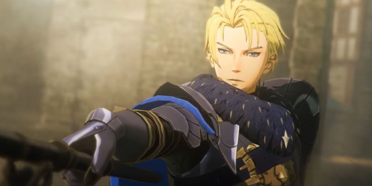
4 Dimitri Has A More Princely Appearance
Dimitri’s design in Fire Emblem: Three Houses doesn’t appear very princely. He did not like the formalities that came with being royalty and wanted nothing more than for other students to approach him and treat him like a friend. His black armor and cape made him stand out, but not so much that he didn’t feel like a student.
In FEW:3H, Dimitri wears a fur around his neck that is reminiscent of a young lion’s mane, but it isn’t nearly as pronounced as the heavy white and black fur he would wear post-timeskip. He also has a metallic lion on the chest plate of his armor, an animal associated not only with his house, but of royalty. His armor is much fancier as well, using bold shapes particularly at his shoulders. This design is just as fitting as his post-timeskip design. This Dimitri doesn’t seem to have gone through the traumatic events that he would have during Byleth’s disappearance, so it wouldn’t make sense for him to look ragged and haunted.
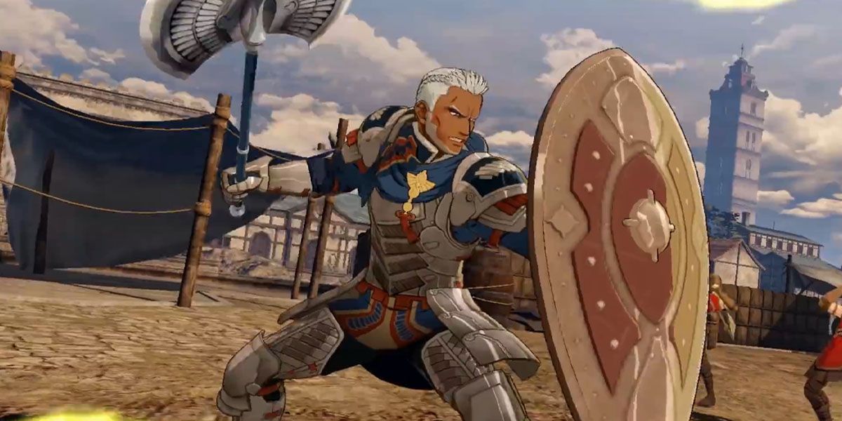
3 Dedue Looks More Mature Than He Does In His Post-Timeskip Appearance
Dedue has experienced minor but impactful changes to his design. His outfit is largely similar to the one he wears post-timeskip, but his fabrics and pauldrons utilize a softer blue instead of green. He keeps the earring from his initial student appearance and has braided his hair, making this design the only one in which he doesn’t wear his hair in a ponytail.
Dedue lacks the scars on his face that he originally received during Byleth’s disappearance. Instead, he has a five o’clock shadow. This makes him one of the two male students with facial hair, and it makes him look more mature than he does in his other designs.
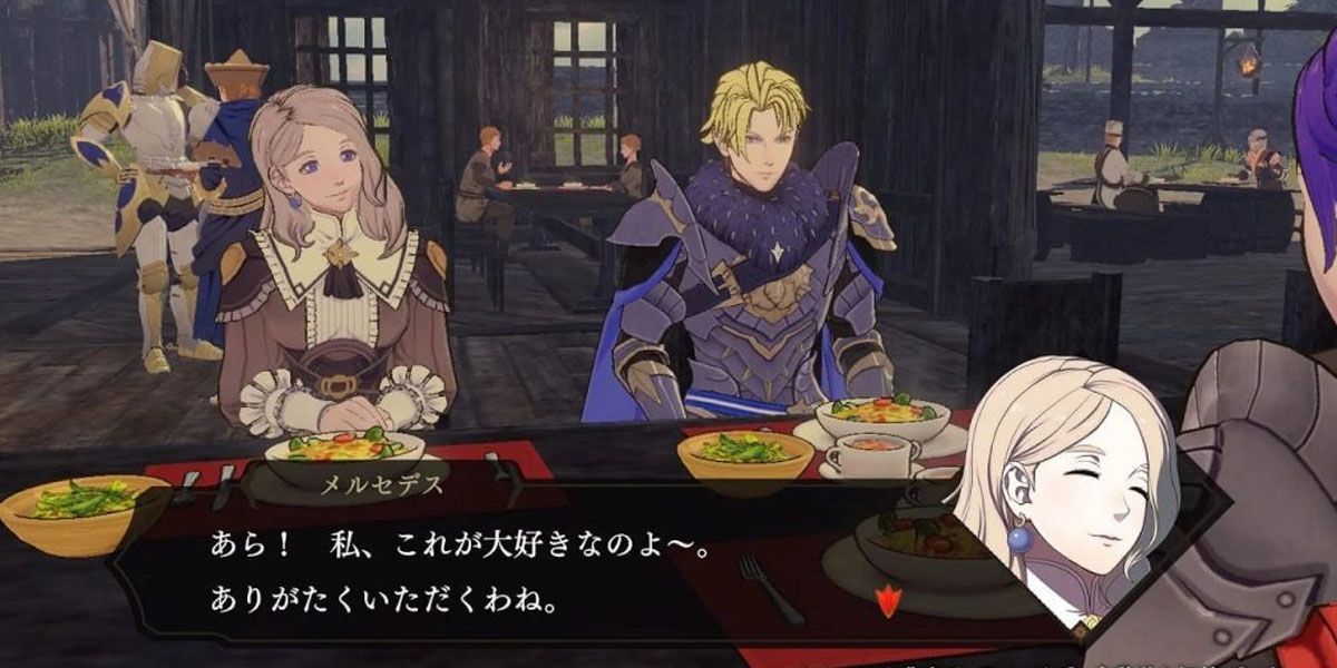
2 Mercedes Looks Like The Big Sister Of The Group
Mercedes is the motherly type and is a very gentle and sweet person. Her frilled dress and the soft curls of her hair emphasize this part of her personality. She doesn’t wear armor like many of the other students of Garreg Mach. Her post-timeskip design focused more on making her look devout, as she holds the Goddess Sothis in high regard.
However, few fans liked her short hair and bangs, as they made Mercedes look like a different person. The two dress designs are very similar, utilizing the same elements such as the belts at her sides and the white cuffs at her wrists. However, her current hairstyle makes all the difference and suits her much more than her short haircut.
1 Annette Is Adorable And Her Personality Is Easy To Determine
Annette’s design stays true to her other Fire Emblem appearances. Good character design makes it easy for people to get a general idea of what the character is like. The cute braids and big eyes show that Annette is an innocent, upbeat character. She likes cute things and sweets, and judging from her long white dress, fluffy cloak, and hair accessories, she cares about her appearance and doesn’t aim to become a powerful knight. She also dresses this way because she went to school for sorcery, making her less likely to be on the front lines. Her post-timeskip design doesn’t work nearly as well as her new one since it makes her dress and hair longer, a combination that makes her look more mature and less like the kind of person who trips over everything.
Read Next
