The 2010s were a revolutionary time for visual effects in the film industry as studios everywhere began taking the next steps in the evolution of CGI (Computer Generated Imagery) technology. The decade started hot off the heels of James Cameron’s trend-setting Avatar, which paved the way for several fully CGI characters to be brought to life on the big screen.
However, where there is progress, there are often setbacks. For every film pushing the limits of special effects and motion capture technology, there were films like the Green Lantern that felt like they belonged in the early 2000s. Some movies looked lousy when they hit theaters, but others worsened as time passed.
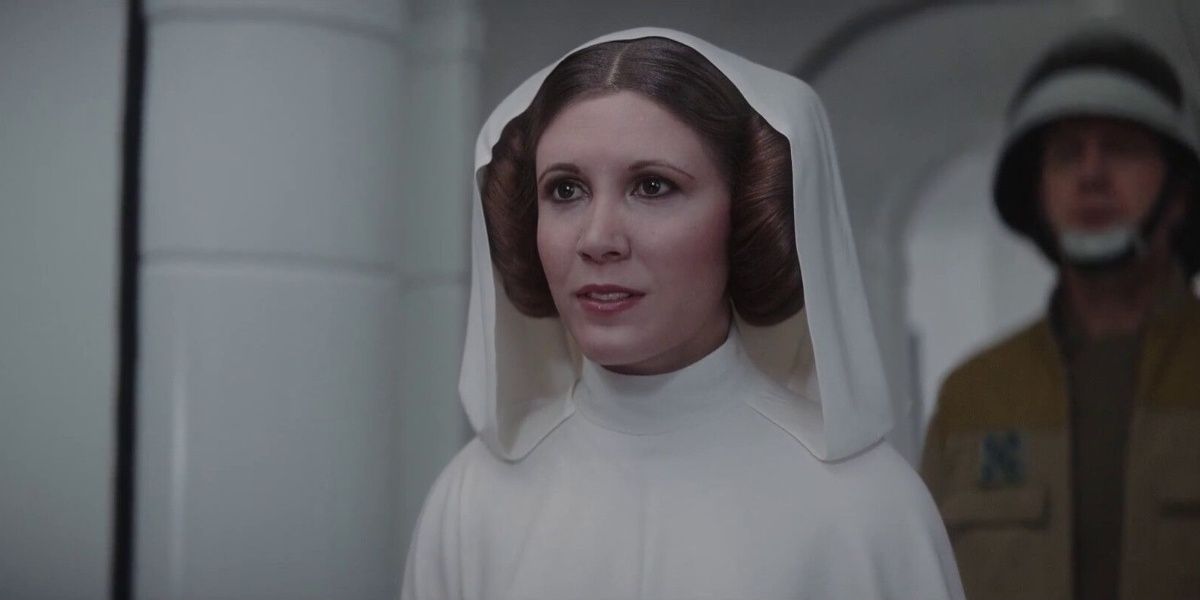
10 Princess Leia And Tarkin Have Gotten Worse Since Showing Up In Rogue One
De-aging effects and face-swapping technology have improved dramatically in the last few years, which is why the “cameos” from Grand Moff Tarkin and Princess Leia in Rogue One: A Star Wars Story have looked worse with each passing year. Tarkin still looks decent due to the dim lighting of imperial ships and the Death Star, but the vibrant white of the rebellion ship makes hiding Leia’s face more difficult, which is why the scene looks far worse.
Other Star Wars properties have attempted de-aging again, this time with Luke Skywalker in The Mandalorian and The Book of Boba Fett, which has been an improvement.
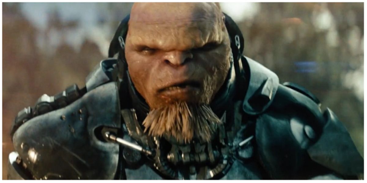
9 Battleship’s Aliens Looked Like They Belonged In A Video Game
Hasbro got lightning in a bottle with the Transformers series, so they tried to capture the magic again with another iconic game, Battleship. Despite the film being a critical and commercial failure, the effects received plenty of praise from fans and critics alike. As thin as the story was, the battles were impressive, and the alien ships and suits looked great for a 2012 movie.
The issue was that once the aliens took off their helmets and started moving their faces, they really stood out from the rest of the film. The aliens looked like something from a late 2010s video game, and it was clear why the movie hid them most of the time.
8 Iron Man’s Nanotech Suit And Bruce Banner’s Floating Heads Were Low Points From Infinity War
In 2008, Iron Man took the world by storm with stunning visual effects and a charismatic lead in Robert Downey Jr. The suit from that film looked amazing. Still, the invincible Iron Man has never looked as good as he did in his theatrical debut. This came to a head in Avengers: Infinity War when Stark debuted his nanotech suit, which looked glossy and uncanny in the surrounding environment.
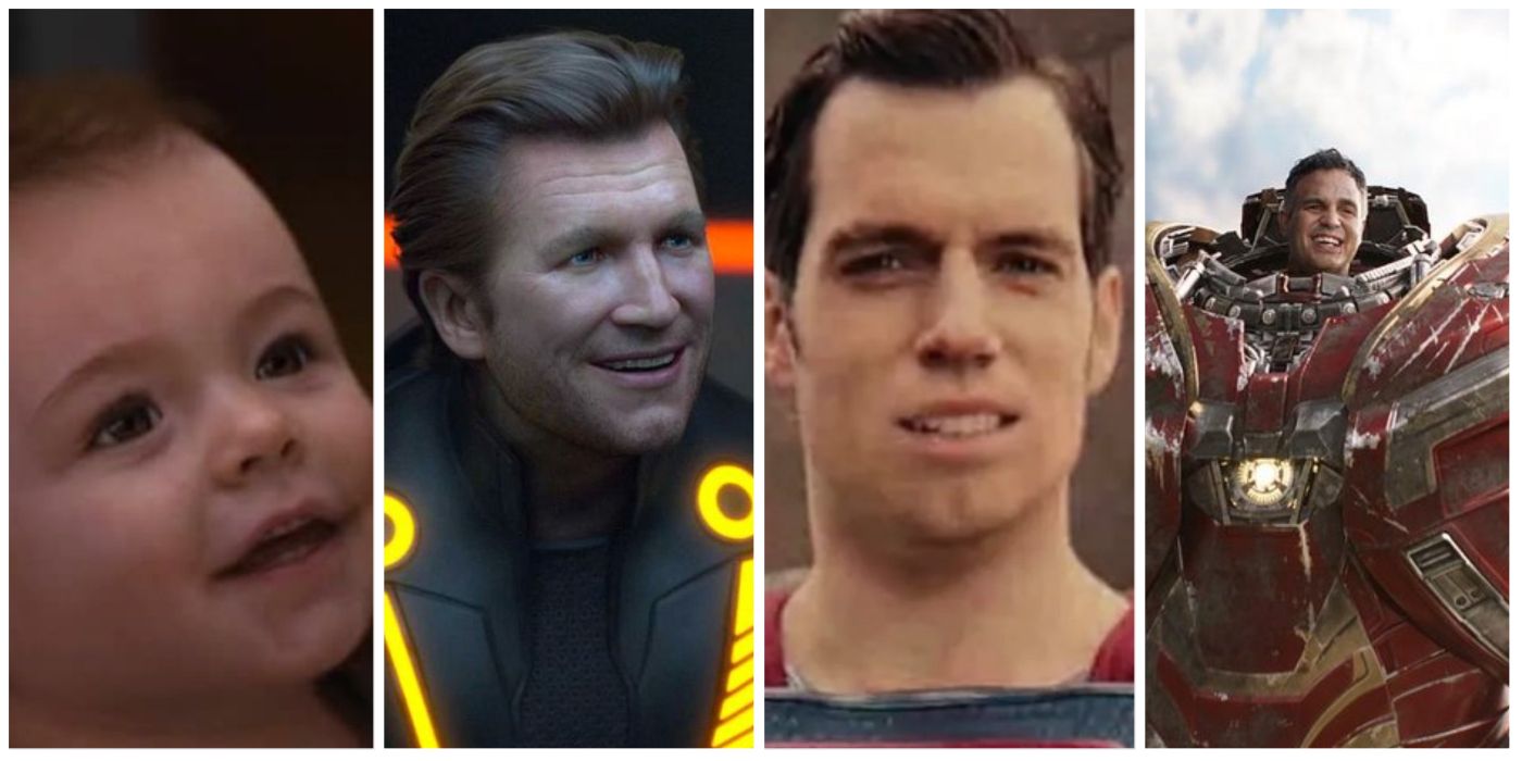
The suit, and Bruce Banner’s infamous floating head in the Hulkbuster suit, were two lowlights in a film that had some breathtaking CGI throughout.
7 Venom Was A Disappointing Start To The Sony Spider-Man Universe
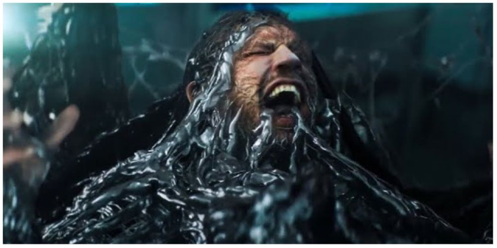
If Sony was going to kickstart their new Spider-Man universe based on the wall-crawling hero’s villains, they needed to stick the landing on their first film, Venom. The studio sacrificed practical effects in favor of a more comic-accurate version of the character, but the result was poor-looking CGI that dominated the film’s third act.
The Spider-Man films have always been ahead of their time in the visual effects department, so for Venom tolook worse than Spider-Man 2, a film released in 2004, was a major letdown.
6 Tron: Legacy Tried To Innovate, But De-Aged Jeff Bridges Was An Eye-Sore
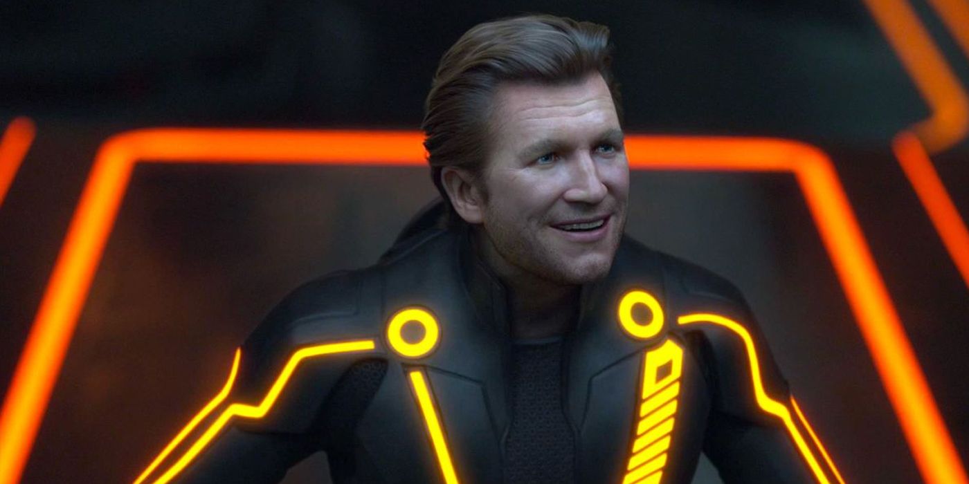
The original Tron’s visual effects were innovative for the time, but the film looks cheesy and downright hard to follow as the years have gone on. Tron: Legacy tried to follow that with innovation and tied Jeff Bridges back into the story, but the result left much to be desired.
The majority of the film actually looks great and does an excellent job of updating the effects and designs from the original movie, but it all goes out the window when a de-aged Jeff Bridges is revealed as the antagonist. The villain looked decent for the time, but as de-aging technology has improved dramatically in recent years, the character looks more like something from a video game and appears cartoonish throughout.
5 The Hobbit: Battle Of The Five Armies Is A CGI-Monstrosity
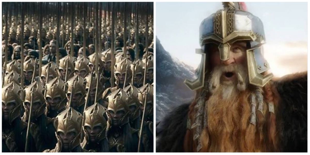
When The Hobbit: The Unexpected Journey introduced the entirely CGI antagonist Azog the Defiler, the reception from the franchise’s loyal fans was mixed at best. The practical orcs from the Lord of The Rings trilogy were gone, and it looked like The Hobbit was more reliant on CGI.
This rang true in the trilogy’s final film, with the famous Battle of the Five Armies turning into a gray mess of CGI soldiers clashing together for the film’s last act. The decision to CGI Billy Connolly as Dain II Ironfoot was the worst part of the battle and cemented the film’s visual effects as some of the worst in recent memory.
4 Dead Men Tell No Tales Was A Huge Stepback For The Pirates Franchise In More Ways Than One
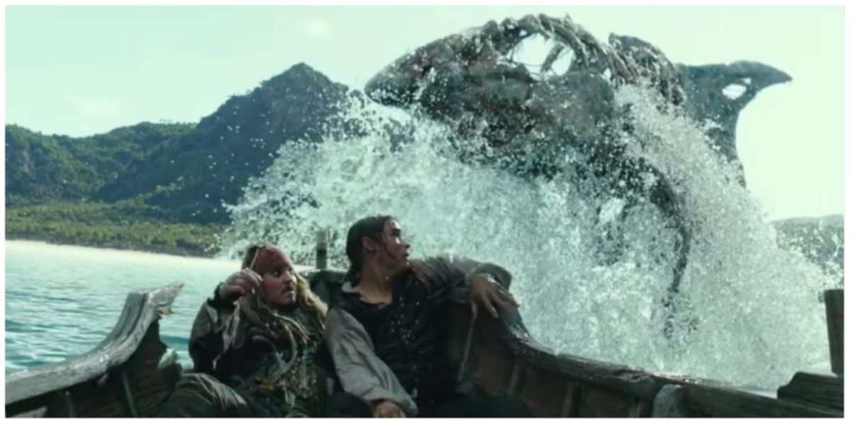
The Pirates of The Caribbean franchise was ahead of its time in the 2000s, from creating the fully-CGI skeleton crew in 2003 to winning the Oscar for Best Visual Effects in 2006 after creating the character of Davy Jones. The original trilogy of films set the standard for blockbuster visual effects, but the fifth film in the franchise went in the wrong direction.
Rather than taking the visual effects to the next stage, the film looked cheap from top to bottom, with the horrendous shark chase scene obviously being shot on a green screen instead of on location like the original films.
3 Black Panther Using CGI Suits Was A Mistake
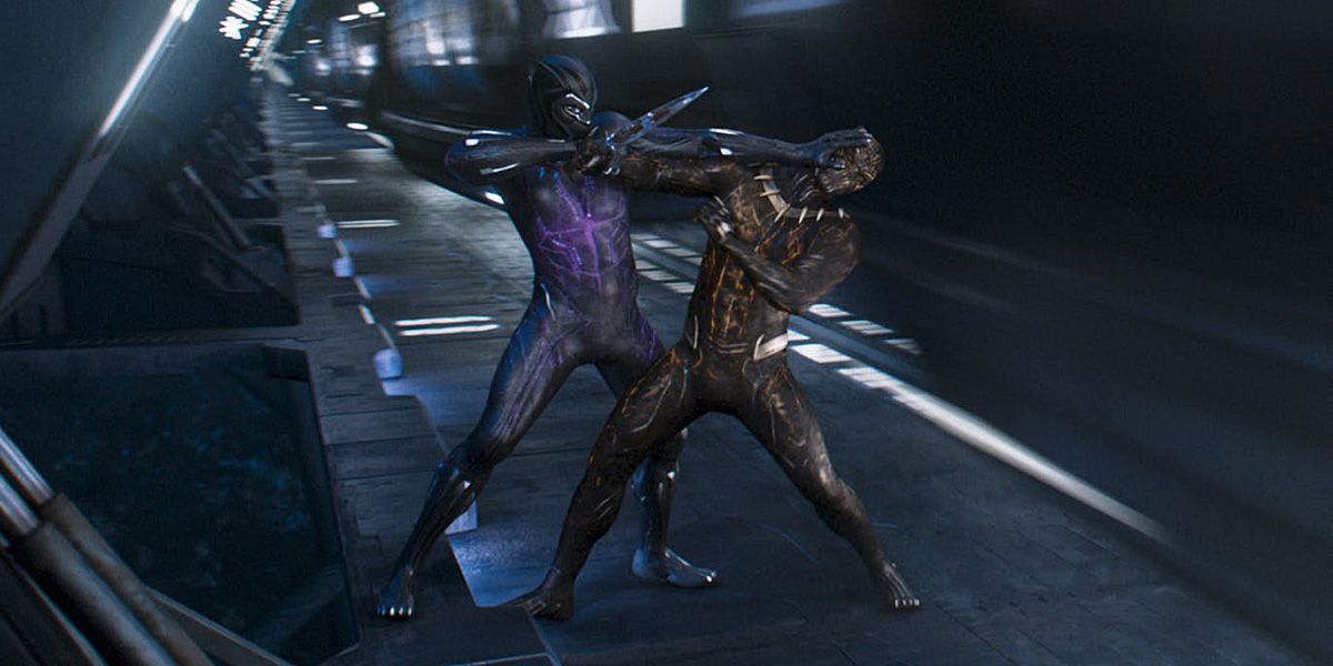
The debut of one T’Challa as The Black Panther in Captain America: Civil War was one of the film’s best parts, with the suit being a highlight for fans and one of the best in the Marvel Cinematic Universe (MCU). This is why switching to a fully CGI suit in the character’s feature-length film in 2018 was a little jarring.
The result was a suit that looked good for most of the film, but it led to a horrendous final fight scene between Black Panther and Killmonger that some fans said looked more like a cutscene from a PS2 game than a Marvel movie.
2 Justice League 2017 Looks Cheap For A $300 Million Movie
Everyone that has seen the film knows about the Superman mustache cover-up. It is still one of the worst displays of visual effects in recent memory, especially since the film opens with a shot focused on the character as he is talking. The mustache debacle will not be forgotten, but the rest of the film also looks cheap.
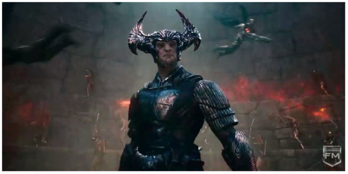
The CGI for the Parademon takeover of the Russian town looks terrible, and Steppenwolf looks even worse. The character is the epitome of generic CGI villain stereotypes and looks awful compared to the version of the character from Zack Snyder’s Justice League.
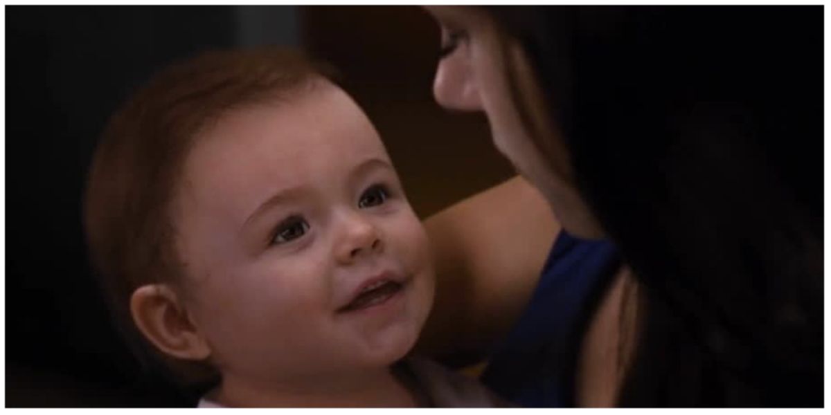
1 The Baby In Breaking Dawn: Part 2 Is Embarrassing
In the finale of a five-film saga that made $3.346 billion at the global box office, this “baby” was approved by the studio. Beyond questions of how this even happened, the real issue is why not go practical? Use a doll and obscure the baby’s face like in American Sniper or just get an actual baby, but the CGI face is still one of the worst effects ever seen on film, and definitely the worst of the 2010s.
The baby is terrible, but the rest of Breaking Dawn: Part 2’s effects were not good either. Bella’s hunt in the woods looks awful, from the running to catching the obviously CGI mountain lion.
.jpg)
